Maven Infosoft Pvt Ltd
Maven Infosoft Pvt Ltd - Maven Infosoft offers excellent IT Services, website designing, SEO, eCommerce & Magento development, mobile app development and CMS solutions!
There are numerous benefits of responsive design for website owners and these have to do with SEO, contacting a broad audience and staying in sync with the most recent trends in web design.
If you are an online entrepreneur or website admin looking for approaches to keep your website and business on top of the competition, extend your reach, increase your conversion rates and keep your clients happy then getting a responsive website should be your first preference.
Responsive design
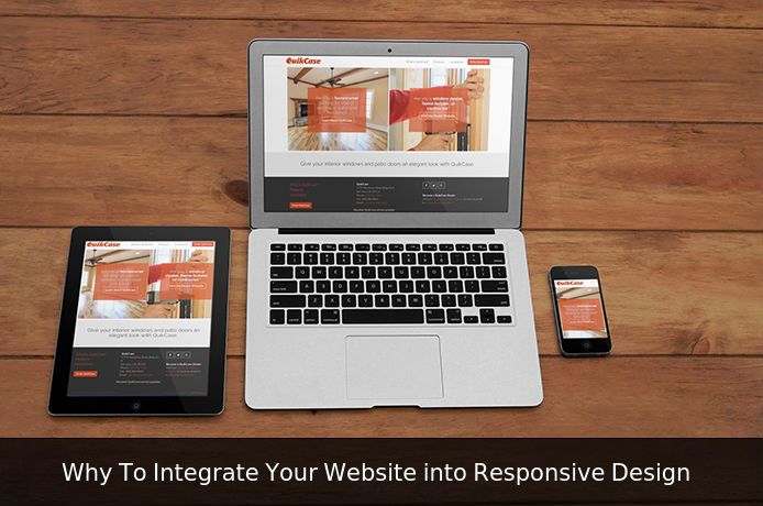
For those that are not well-known with the term ‘responsive web design’, the easiest definition is that a responsive website is optimized for viewing on various types of devices, screens and resolutions. In other words, the design adapts to the available review space offering the user with a good experience without moving left and right with a scroll bar or zoom-in, zoom out to peruse the text or view an image.
What is not a responsive design? A site that looks precisely the same on mobile as it looks on the desktop, but in a smaller size, is not a responsive layout. With a responsive design, you can explore and interact with a website on your preferred device without zooming in or out.
Mobile website vs. Responsive website
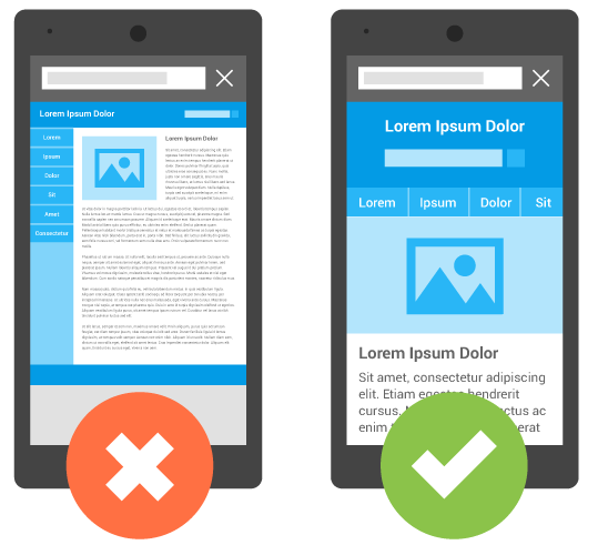
Numerous people have a tendency to confound a mobile friendly site with a responsive site, but that is not precisely the same. A mobile friendly website looks great on cell phones, but may not look so good for devices with bigger resolutions.
In most of the cases, there is the desktop version of a website and after that, there are dedicated pages improved for mobile which is not the same as those shown on the desktop.
While these sites look great on the desktop and mobile, if you see them on multiple devices the user experience is not okay.
With responsive sites, there is only single set of web pages and single set of code for a site and what is changing is the way those pages adapt to the different devices.
The simplest approach to check responsive website is to change your browser width and perceive what it would appear on the screen? If the design adapts well and the site still looks great, then it is responsive.
Top Reason to Choose Responsive Design
Better User experience
While quality written content makes all the difference, and discoverability of content are first achievement metrics, it is the user experience that empowers visitors to devour content on any website through their preferred device and inclination, anytime. Accordingly, responsive web design is about giving the optimal user experience regardless of whether they utilize a smart-phone, a tablet, computer, or a smart TV.
Cost Effective
Responsive websites take somewhat more to put together. However, they survive longer, and the unified approach means administration, support and updates only need be applied to one spot. That saves time and money.
A tremendous advantage of adopting a responsive design is that it requires less investment than creating an additional stand-alone mobile site, which is how things have been done before. Testing various versions of a site also increasing improvement and maintenance overheads.
Entrepreneurs also find it far easier and less tedious to manage and maintain a solitary site, with generously less content to manage. In addition to this, a solitary administrator interface can without much of a stretch be improved, utilizing design and work process devices to achieve the true right substance.
Web sites designed only for mobile phones don’t offer the navigational methods found in customary desktop websites; they also require the user to maintain two separate web addresses for your web page.
The development and support of one site cost under two and can result in considerable savings.
Improve Conversion Rates
Besides all of the search advantages of having a responsive website, it can increase those sought-after conversion rates from all of the mobile users. Why? All things considered, if a site does not work adequately on mobile or tablet device, clients will not be able to convert.
When a user needs to accomplish more work than required to complete a conversion, do you think that they will switch? Perhaps, but it is more improbable.
If a user visits your website and encounters an issue on their favored device, you are liable to lose that potential business. In any case, if the potential user can access to your website with ease from any device, they are unrealistic to switch to a competitor. Increasing a users voyage and experience will increase conversion rates and improve sales.
Improved Ranking in mobile search result
Both desktop and mobile website requires separate SEO campaigns. Managing one site and one SEO campaign is far simpler. This is a key point of interest a responsive website has over a separate mobile site.
That being said, there are advantages to having a mobile-specific SEO system, for example, optimizing for keywords that will probably be searched when somebody is on their smart-phone.
Conclusion
Responsive design permits one to stay ahead of the trend. As the interest for media-rich mobile Internet and apps continue to increase, various essential implications such as advancement and maintenance costs, better conversion rates and visitors get the best customer experience. We recommend website owners to keep both their clients and Google happy, via providing responsive web design.
Image Source: http://goo.gl/4lvFxY, https://goo.gl/aPpx8C
The post Reason To Integrate Your Website into Responsive Design appeared first on Maven Infosoft Pvt Ltd.